
Typical Magazine
Website Redesign & Mobile UI
Scope: To visually relay the message of the online publication while being easy to navigate, and story focused.
Contribution: UX research, Wire framing, Prototyping, and Mobile. while alongside with a designer/developer who is building the main site.
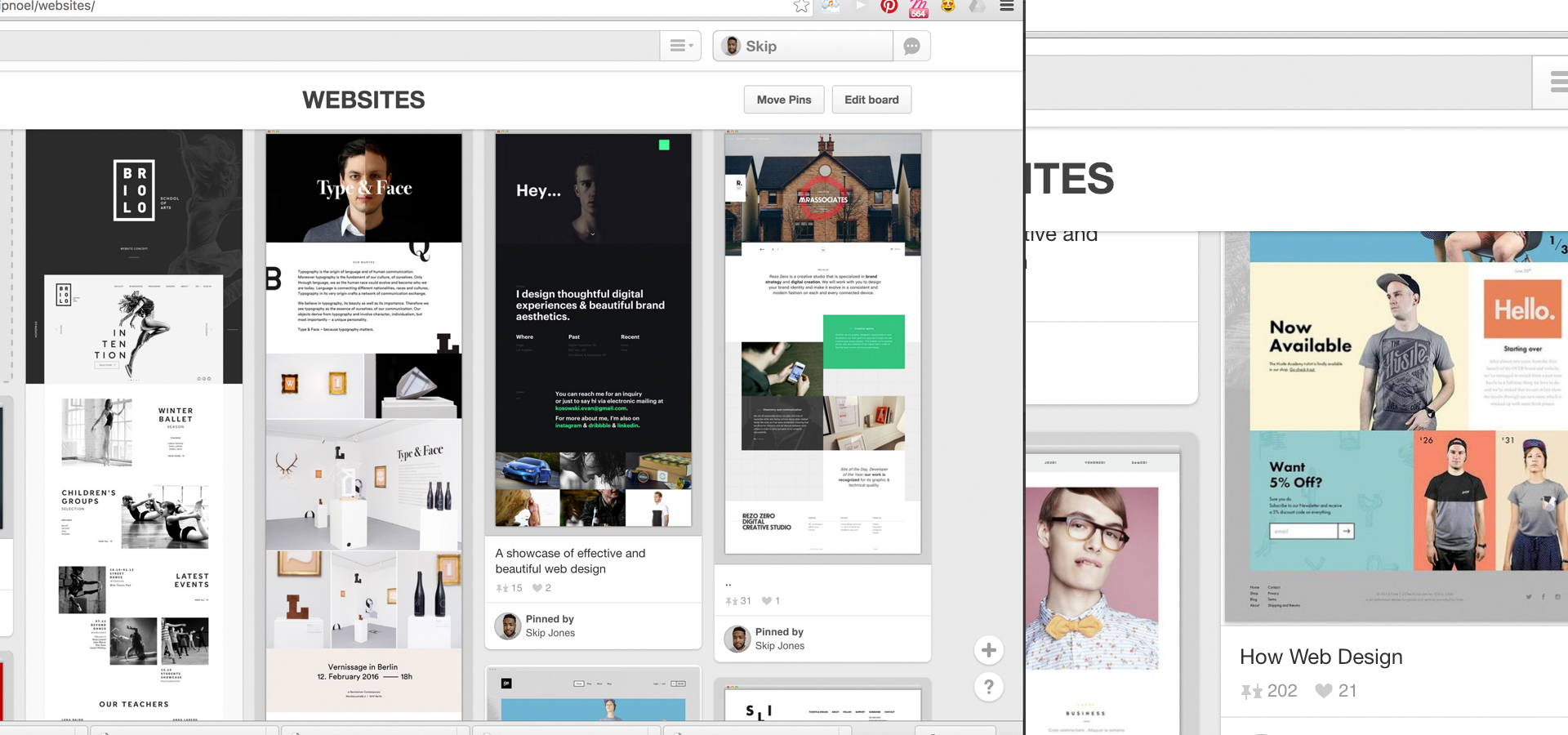
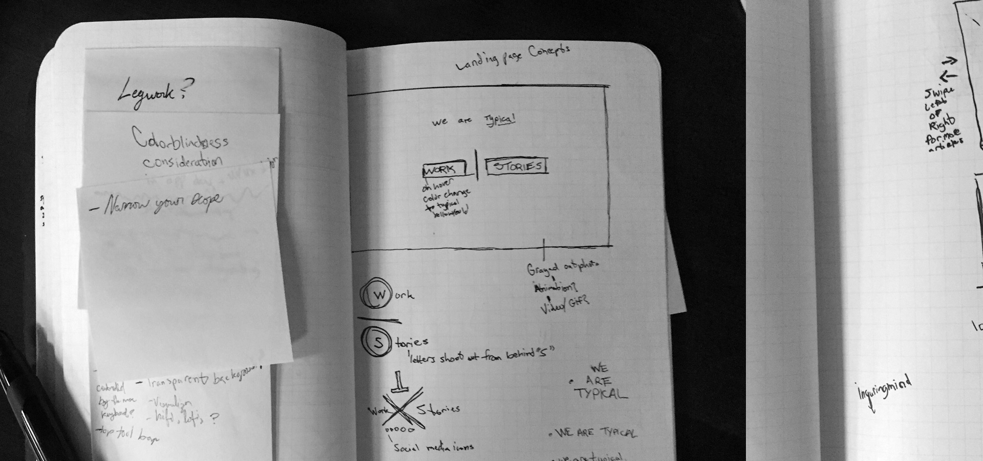
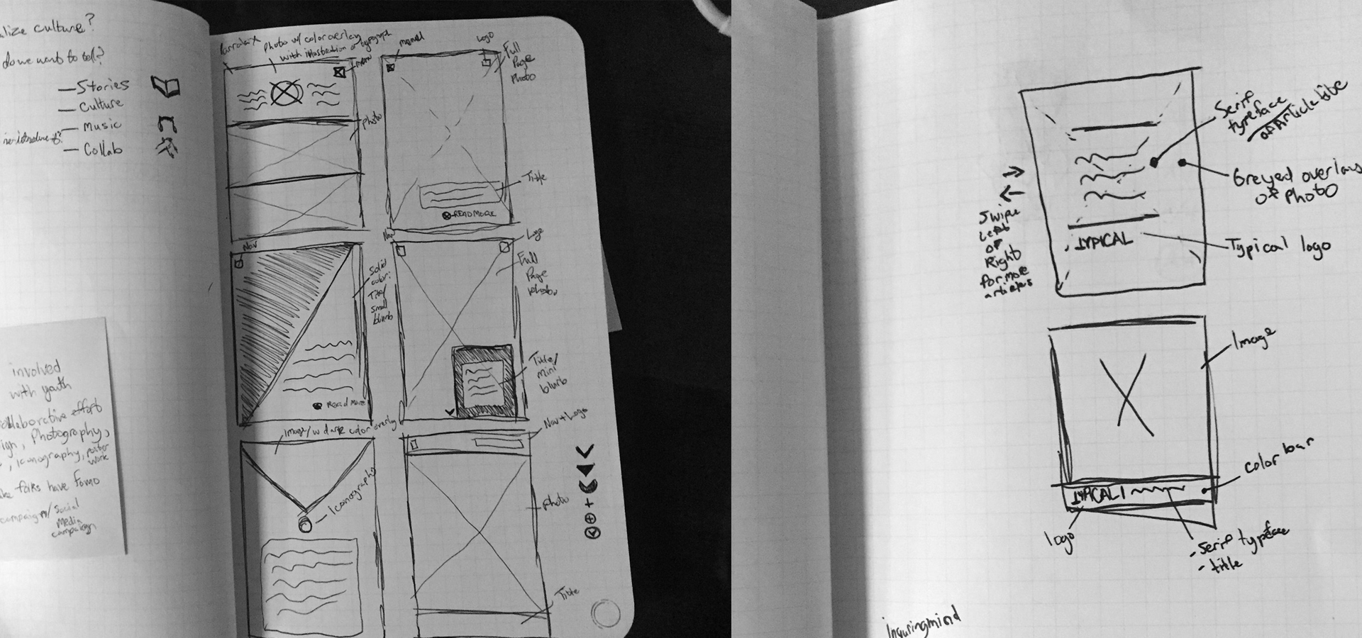
I initially started by having the Typical team create a mood board on Pinterest to get an idea of what appealed to them aesthetically and functionally. From there I began to map out their "wishlist" of what they wanted for the site, how the site should flow, and began some sketches for the layout.

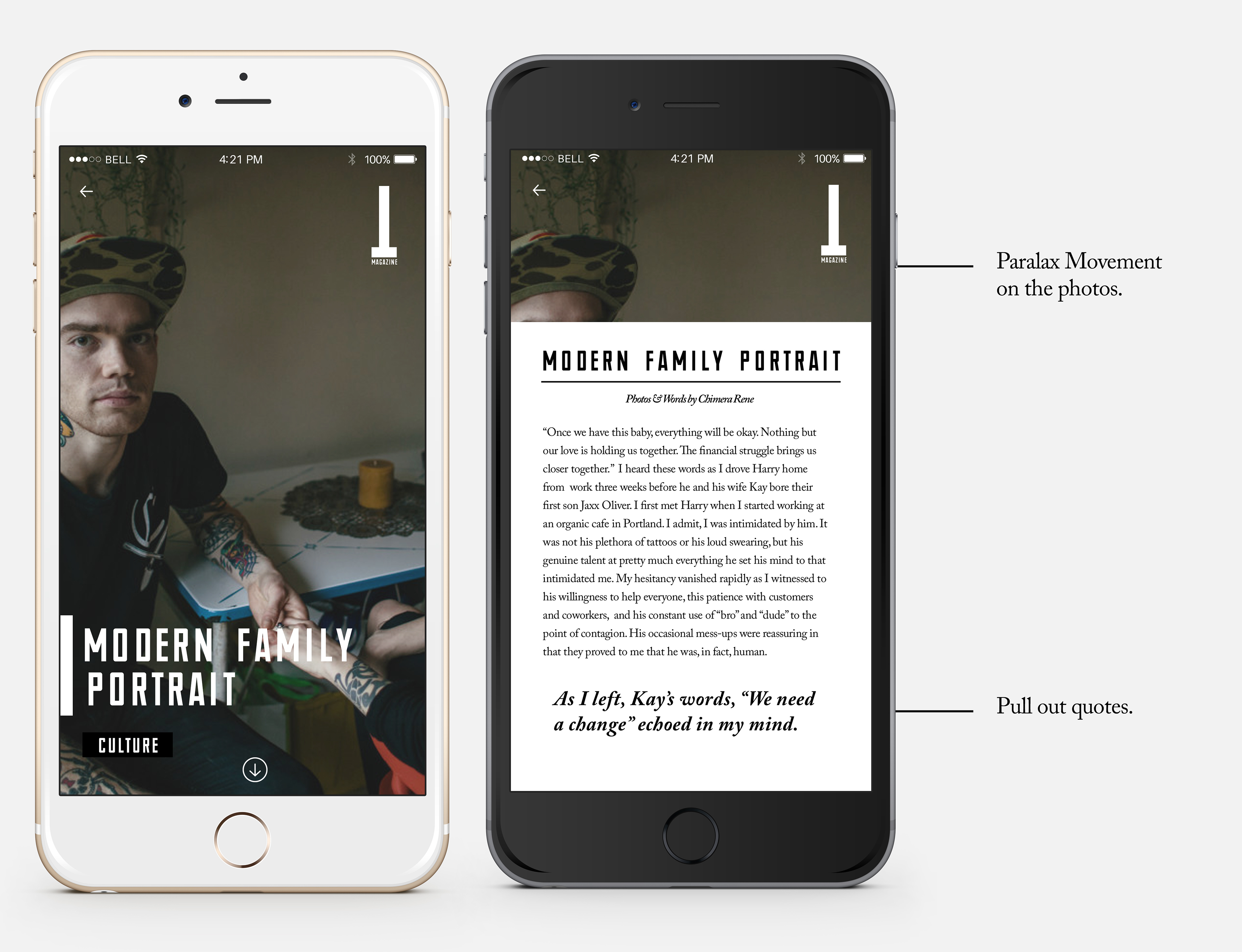
After sketching and some wire framing I worked an initial mockup for the site but that was eventually handed over to another designer/developer and I was tasked with working on the mobile experience since the majority of their traffic was from Instagram, Facebook, Twitter, etc.

The site is very photo-centric so I wanted to create an experience that was simple to navigate but made sure that the photography was what drew you in. I worked through multiple iterations using photoshop, sketch, and prototyped in Pixate to explore some of the micro-animations.

The site is currently parked as development is finished and should be live soon.